What Does It Mean When a Slot Animation Interferes With Information?
A slot animation interferes with information when motion, effects, or decorative elements make important on-screen details harder to see, read, or use. The problem might be brief—such as a bright win effect covering the balance—or persistent, like a banner that sits over the spin controls. Either way, the animation is competing with information the player needs.
This is more than a question of taste. A game can have polished artwork and still present its rules or controls poorly. To assess the experience clearly, separate what the game’s rules say from what its visuals suggest: an animation may look like a signal, but it does not change the rules or predict a result. The practical concern is whether the interface lets players understand the game and operate it without unnecessary friction.
What Counts as Information in a Slot Interface?
Information includes more than the paytable. Players may need to identify the stake, available balance, win amount, paylines or ways to win, feature instructions, spin controls, and game settings. On a casino site, they may also need to find account, deposit, or responsible-play options outside the game itself.
Animation becomes an information problem when it hides, replaces, or distracts from those elements at a moment when they matter. A celebration can be visually appealing, but if it obscures the amount won or prevents access to a control, the presentation is getting in the way of use.
- Obscured reels: Particles, character art, or a pop-up cover symbols that players may want to inspect.
- Blocked text: A feature message or instruction sits behind a banner, animation, or button.
- UI conflict: Moving artwork competes with interface elements for space, contrast, or attention.
- Interrupted controls: An effect delays or covers a button without making it clear when the control will be available again.
- Unclear state changes: Motion makes it difficult to tell whether a spin is in progress, complete, or awaiting input.
Not every animated effect is a problem. A short reel transition can help show that a spin has started. The test is whether the animation communicates a useful state without making other necessary information harder to access.
Separate the Visual Impression From the Game Rules
Slot visuals are designed to attract attention and create atmosphere. A glowing symbol, dramatic pause, or celebratory sequence can make a moment feel significant. But the rules—not the dramatic presentation—define how symbols, features, and payouts work.
This distinction matters because players can read meaning into visual cues that the game has not promised. A near miss may feel suggestive; a prolonged animation may feel like a clue. Neither is evidence that a particular result is more likely. Likewise, sound effects do not predict wins. They are part of the presentation, not a dependable guide to future outcomes.
Clear interfaces help maintain that boundary. They show the relevant result and its value in readable text, make game rules available, and avoid using decorative effects in a way that could be mistaken for an instruction or guarantee. If an animation temporarily covers the result, the game should make the state easy to understand once the effect ends.
Why Animation Can Clash With Information
Motion takes attention
People tend to notice movement before static text. A burst of light, bouncing character, or expanding overlay can pull the eye away from a balance display or a small rules link. The effect may last only a moment, but repeated interruptions can make the interface tiring to use.
Small screens leave less room
Mobile layouts have less space to accommodate reels, controls, labels, and promotional details. An animation that stays clear on a large monitor may overlap a button or crop a message on a phone. Screen orientation, browser scaling, and accessibility settings can change the available space further.

Contrast and timing affect readability
Text can technically remain on screen yet still be difficult to read if its background is busy, its contrast is weak, or it appears for too little time. Fast-moving highlights can create a similar issue by drawing attention away before a player has finished reading.
Different screens may be designed by different teams
A game’s reels and animations may be built by one company, while the casino’s lobby, navigation, account tools, and promotions are managed by another. If those pieces do not fit together, the result can feel disjointed. A control that is clear in the game may sit awkwardly beside an operator’s overlay, or a site notice may cover part of the game screen.
Operator Versus Provider: Who Is Responsible?
A casino operator and a game provider have different roles. The provider produces the game itself, including its rules, artwork, reel behavior, and in-game interface. Pragmatic Play and Games Global are examples of companies associated with game content. The operator runs the casino service and presents a selection of games to its customers.
MrQ, for example, should be understood in the context of the operator side of the experience rather than treated as a game developer. An operator can offer content from multiple providers through an online casino catalogue, while each individual title retains its own design and presentation.
That division does not mean one side has no responsibility when information is hard to use. A provider can review how animation interacts with game controls, rules, and result displays. An operator can check how the game appears within its are slot sounds rigged site, how it behaves on supported devices, and whether site-level overlays interfere with it. The exact responsibilities vary by product and implementation, but good presentation requires both sides to pay attention to the full experience.
Experience area Typical focus Questions to ask Game content Provider’s game design and interface Can players read rules, results, and controls during or after animations? Casino platform Operator’s website, navigation, and account features Do site banners, menus, or notices cover the game or its controls? Combined experience How the game and casino platform work together Does the layout remain usable across devices, sizes, and settings?Multi-Provider Catalogues Add Another Layer
A multi-provider casino catalogue gives an operator a broad mix of games. That range can be useful to players, but it also means the operator is presenting titles built with different visual styles, control layouts, and technical approaches. One game may use restrained transitions; another may fill the screen with layered effects.
The operator’s catalogue is therefore not just a list of titles. Its surrounding design can influence how easily players find a game, understand its information, and return to account tools. A consistent lobby can make navigation feel coherent even when the games themselves have distinct art directions. But consistency should not be confused with making every game look identical. The aim is to preserve the provider’s intended design while keeping the operator’s own interface clear and predictable.
This balance matters around the player account system, too. Account information, transaction options, and support routes belong to the casino service rather than to a particular game’s reel animation. If a full-screen effect or site-level element makes those routes difficult to find, the overall experience may feel confusing even when the game itself is functioning as intended.
Art Direction and Visual Cohesion
Strong art direction gives a game a recognizable identity. Color, typography, symbols, character movement, and transitions can all support a shared theme. Visual cohesion becomes a usability concern, however, when decorative choices reduce the clarity of practical information.
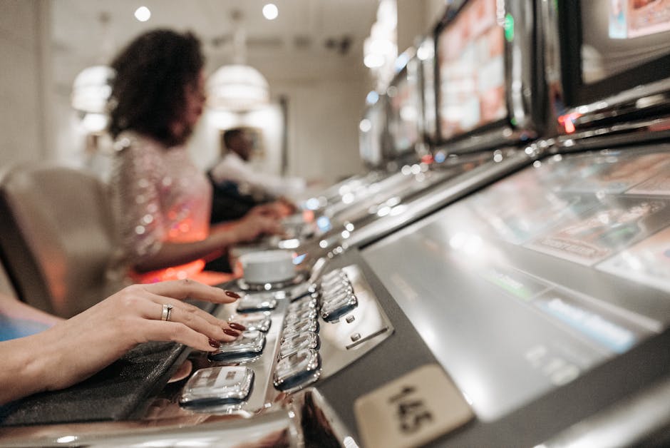
For example, low-contrast text may blend into a detailed background. A large character animation may cover a section of the reels. A feature title may appear in ornate lettering that looks appropriate to the theme but is difficult to read at phone size. These are not necessarily failures of the concept; they are signs that presentation needs to be checked in context.
Good design can preserve atmosphere without asking players to sacrifice legibility. Information can sit on a stable, high-contrast panel, while decorative effects remain in areas that do not cover controls or important text. Motion can have a clear beginning and end, and key details can remain available after a temporary animation has finished.
Animation Is a Cross-Team Collaboration
Animation is not only an artistic task. It can involve game designers, illustrators, interface designers, developers, quality-assurance teams, and the operator’s product or platform teams. Each group may see a different part of the experience, so a problem can slip through if testing focuses only on whether the animation looks attractive in isolation.
Useful review considers the whole screen and the moments when information is most important. Teams can test feature explanations, result displays, control availability, and transitions on different devices. They can also check what happens when text scaling, reduced-motion preferences, or narrow viewports change the layout.
A practical review process might include these steps:
- Identify essential information. List the controls, labels, results, and instructions a player may need at each stage.
- Map the animation. Note where motion appears, how long it lasts, and which interface areas it overlaps.
- Test real screen sizes. Check mobile and desktop layouts, including common browser scaling and orientation changes.
- Check alternatives. Confirm whether players can still find rules, settings, and account options when an effect is active or complete.
- Review the combined product. Test the game within the operator’s actual site, not only in a standalone preview.
These checks are about usability, not about inferring anything from an animation about a game’s fairness or certification. A polished visual experience does not, by itself, prove that a game has been independently tested or approved. Those questions require separate evidence and should not be answered by the artwork.
What Players Can Look For
When an animation feels intrusive, notice what is difficult to do rather than judging only whether the effect is attractive. Can you read the win amount? Are the reels visible? Is a control covered, disabled, or merely waiting for the animation to finish? Can you open the rules or reach casino account options without losing track of the game state?
If information remains inaccessible, check whether the game offers settings to reduce motion or adjust the display. If the issue appears to come from the casino page—such as a site banner sitting over the game—the operator’s support channel is the appropriate place to raise it. If it happens within a specific title, include the game name, device, and a brief description of the affected screen when reporting it.
The Bottom Line
When a slot animation interferes with information, the visuals are competing with the interface instead of supporting it. The issue may involve obscured reels, blocked text, or a broader UI conflict between the game and the casino platform. The fix usually starts with clear responsibilities: providers need to make game information usable, while operators need to present multi-provider content without burying controls or account routes.
Animation can add character and make a game feel cohesive. It should not make basic information hard to find. The clearest experiences keep the rules readable, the controls understandable, and the visual effects in their proper role: presentation, not instruction or proof.